

Learn cinematic color grading through a professional workflow covering color correction, luminance, contrast, skin tones, LUTs, scopes, monitor calibration, cinematic looks, and techniques for creating a refined film like image.
← Back to Editorial
← Back to Editorial
Fix Luminance Before Hue: Practitioner’s Cinematic Color Grading
August 29, 2026
Cinematic color grading is the creative post-production process that sculpts mood and narrative meaning through tone, contrast, and color relationships, not filters or presets. It works because it directs the eye and shapes emotional response before a viewer consciously notices why. What follows is a practical workflow, honest tool recommendations, and the same luminance-first thinking Imagestudio applies on commercial and music video sets.
TL;DR:
- Proper calibration and shot matching are essential in ensuring consistent skin tones, blacks, and exposure before applying creative LUTs or styles.
- Luminance structure guides viewer perception more effectively than hue, so adjusting contrast and shadow detail should be the primary focus.
- High-quality scope tools like waveform and vectorscope are critical for technical accuracy, with monitor calibration being non-negotiable.
- Recreating popular cinematic looks involves subtle, deliberate adjustments in tone and saturation, not extreme, overdone effects.
- Common grading mistakes often stem from technical errors, such as uncorrected white balance or display calibration, rather than creative choices.
Table of Contents
- What Cinematic Color Grading Actually Changes
- Color Correction vs. Color Grading: Fix This Before You Style Anything
- Core Techniques for a Film-Like Grade
- Software, Scopes, and Monitor Calibration That Actually Matter
- Recreating Popular Cinematic Looks Without Overdoing Them
- A Workflow You Can Repeat on Every Project
- How Imagestudio Applies This on Commercial and Music Video Work
- What Grading Looks Like in Films You Already Know
- When a Grade Goes Wrong: Common Problems and Fixes
- Why Luminance, Not Hue, Should Lead Every Grading Decision
What Cinematic Color Grading Actually Changes
Cinematic color grading is the process of altering footage’s color and tone to achieve a specific emotional and visual effect, distinct from the raw technical fix that happens before it. A colorist, in the fullest sense of the job, acts as a translator, making sure the emotional intent baked into a script and a shoot day survives the trip through post production.
The single biggest misconception among newer editors is that grading is mostly about hue. It isn’t. Luminance structure, meaning where shadows, midtones, and highlights sit on the tonal scale, usually directs viewer perception before color temperature does. A grade with strong tonal organization but restrained saturation will read as more cinematic than a heavily saturated grade with flat, undifferentiated tone. Get the luminance right first, and the color choices that follow become far easier.
The attributes actually being manipulated are fewer than most tutorials suggest:
- Contrast, which sets the separation between shadow, midtone, and highlight zones
- Saturation, applied selectively by tonal region rather than globally
- Color balance, the warm or cool lean of shadows versus highlights
- Black level, or how “true” the darkest point of the frame reads
- Highlight roll-off, the softness or hardness of how bright areas clip
Color Correction vs. Color Grading: Fix This Before You Style Anything
Color correction fixes technical problems in the footage. Color grading is the creative layer applied on top, and skipping straight to the creative pass without correcting first is the most common reason a grade falls apart across cuts. If shot A is a half stop brighter than shot B, no LUT will hide that inconsistency once the scene is intercut.
Run this checklist before touching a creative tool:
- Set white balance per shot, using a gray card reference where possible, so skin tones don’t drift warm or cool between angles.
- Check exposure against a waveform monitor, aiming for skin tones to land in a consistent, repeatable range rather than eyeballing brightness on an uncalibrated screen.
- Match shots within a scene, so cuts between camera angles or lighting setups don’t create visible jumps in brightness or color cast.
A waveform, vectorscope, and RGB parade are the three scopes worth learning early. They don’t tell you what looks good, but they tell you when two shots that should match, don’t. That distinction is worth understanding the full difference between color correction and color grading before moving further into stylized work.
Core Techniques for a Film-Like Grade
Once footage is corrected, build the cinematic look in a deliberate order rather than grabbing wheels at random.
Start with luminance structure. Decide where you want the eye to land, then push midtone contrast to support that. Lifted blacks come next: instead of letting shadows crush to a pure zero on the waveform, aim for something closer to 3 to 8 percent. That small floor is what gives digital footage the softer, less clinical shadow quality associated with film stock, while highlight roll-off should stay gentle enough to preserve detail rather than clip hard.
From there:
- Nudge shadow color toward teal or blue in small increments, which reads as cool and contained without looking artificial.
- Reduce saturation in highlights specifically to avoid the neon, oversaturated look that plagues amateur grades.
- Isolate skin tones using HSL qualifiers so global saturation and hue shifts don’t turn faces orange or sickly.
- Treat a LUT as a starting point, not a finished look. Apply it at moderate opacity, then refine with wheels and curves underneath.
Pro Tip: Duplicate your node or layer structure before applying a LUT, so you can drop its opacity independently of your manual corrections instead of baking both into one flattened adjustment.
Software, Scopes, and Monitor Calibration That Actually Matter
DaVinci Resolve remains the standard for serious color work, largely because its node-based structure and built-in scopes were purpose-built for grading rather than bolted onto an editing timeline. Premiere’s Lumetri panel and Final Cut’s color tools are perfectly capable for editorial-style grading inside a familiar cutting environment, and for short-form or social content they’re often the faster choice.
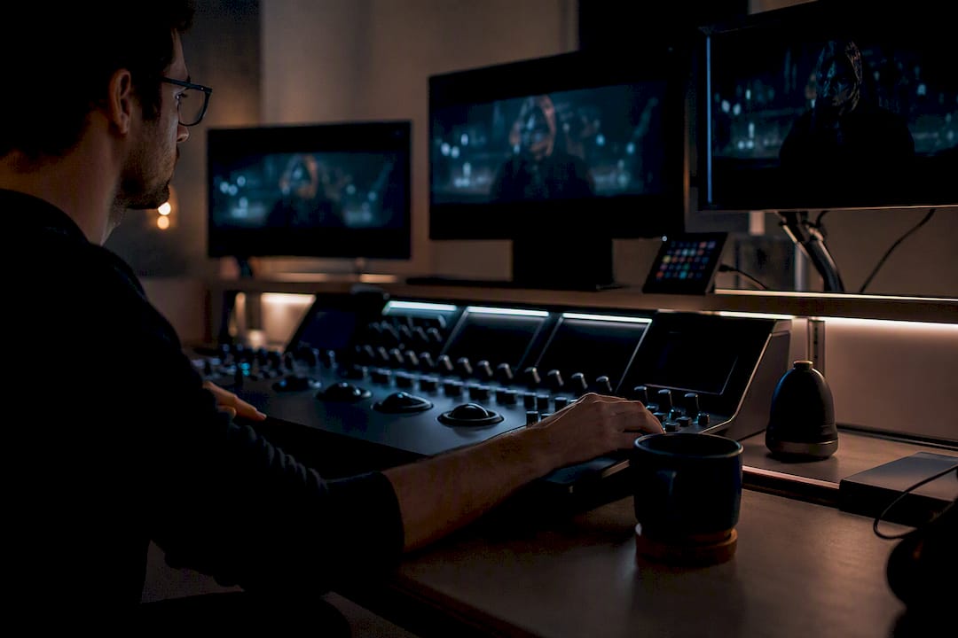
A control surface with physical trackballs speeds up repetitive grading work across many shots, but a mouse and keyboard handle a single project fine. What you cannot skip is monitor calibration. Many failed grades trace back not to bad creative choices but to an uncalibrated display lying about what’s actually in the frame.
A short calibration and monitoring checklist:
- Calibrate your display to a known standard, or at minimum compare it against a reference monitor before finishing a paid project.
- Watch your scopes, not just your eyes, particularly under inconsistent room lighting.
- Separate your LUTs by role: input LUTs to normalize log or RAW footage, creative LUTs for stylizing, and output LUTs to prep for a specific delivery format.
- Apply output transforms last, after the creative decisions are locked, not before.
If you’re shooting on Blackmagic gear, understanding how Blackmagic’s Studio Camera 4K handles log capture upstream will save you correction headaches once footage lands in Resolve.
Recreating Popular Cinematic Looks Without Overdoing Them
Certain palettes recur across film and commercial work because each one carries a specific emotional shorthand, and each has a fairly repeatable technical recipe behind it.
- Teal and orange: push shadows toward teal, lift midtones slightly warm, and protect skin tones with an HSL isolation so faces don’t inherit the shadow’s cool cast.
- Bleach bypass: desaturate globally while boosting contrast, a combination that suits gritty, high-stakes genres like war or crime drama far better than lighter content.
- Monochrome: build contrast carefully in black and white, keep a touch of grain, and watch that shadow detail doesn’t collapse into pure black in the process.
Work from reference stills pulled from films with the mood you’re chasing, and resist pushing any single look to its extreme. The most common beginner mistake isn’t picking the wrong style, it’s applying the right one at twice the intensity that actually reads as intentional.
A Workflow You Can Repeat on Every Project
A consistent grade starts before the camera even rolls, not in the timeline.
- Shoot for the grade: capture in log or RAW where possible, expose for the highlights, and keep ISO low to protect shadow detail you’ll need later.
- Ingest and organize footage, and if you can, shoot a reference still or color chart frame at the start of a scene for matching later.
- Run the technical correction pass first, matching shots and setting accurate black and white points before any creative decision.
- Apply your creative pass: a LUT base at reduced opacity, refined with wheels and curves, with skin tones isolated separately.
- Finalize with vignettes or grain if the story calls for it, then deliver in the correct color space, whether that’s Rec. 709 for standard web delivery, ACES for a VFX-heavy pipeline, or HDR for platforms that support it.
- Verify the final grade on a calibrated monitor, and if possible, preview on the actual devices or platforms your audience will watch on.
Pro Tip: Scopes measure the image, but they don’t measure the scene’s intent. Cross-check every major grading decision against the story beat you’re trying to serve, not just the numbers.
If you’re prepping a shoot with this workflow in mind, a solid pre-production checklist helps make sure exposure and format decisions are locked before you ever open a grading panel. For a fuller look at how correction and grading connect across an entire production, Imagestudio’s complete color correction workflow walks through the same principles in more depth.
How Imagestudio Applies This on Commercial and Music Video Work
Over 14 years and more than 250 projects generating upward of 150 million views, Imagestudio has built its color pipeline around the same luminance-first principle covered above: establish tonal hierarchy before touching hue, and never let a creative grade outrun a calibrated correction pass.
On music video sets in particular, where lighting changes scene to scene and skin tones under colored practicals are notoriously hard to protect, that discipline matters more than any single LUT or preset.
For readers who want to go deeper than a single article can cover:
- Imagestudio’s breakdown of a music video color grading workflow that holds up across format changes
- A theory-first companion piece on color grading photography, useful if you shoot stills alongside motion work
- The Imagestudio Academy, for structured, hands-on lessons beyond a primer
What Grading Looks Like in Films You Already Know
Mad Max: Fury Road is the textbook teal-and-orange case study, but the detail most tutorials skip is how aggressively the film protects highlight detail in its desert scenes even while pushing shadows hard toward teal. That restraint in the highlights is why the grade reads as stylized rather than broken.
The Revenant leans on a colder, desaturated palette in its wilderness sequences, using lifted shadows and muted saturation to communicate cold and exhaustion without ever tipping into the flat, lifeless look that under-lit desaturation can produce when handled carelessly.
Bleach bypass shows up across a run of gritty crime and war films, most recognizably in high-contrast, low-saturation combat sequences where the desaturation itself becomes part of the emotional register, signaling danger or moral ambiguity before a single line of dialogue does.
Monochrome work, when done well, resists the temptation to crush contrast for drama’s sake. The films that hold up years later keep enough shadow detail that black and white still feels dimensional rather than like a filter slapped over color footage.
The pattern across all three: the technique serves a specific emotional or narrative job in each film, it isn’t a default aesthetic choice. That’s the detail worth studying more than the technique itself.
When a Grade Goes Wrong: Common Problems and Fixes
The most frequent issue newer colorists run into is a grade that looks fine on the grading monitor and wrong everywhere else. That’s almost always a calibration problem, not a creative one. If you haven’t checked your display against a known reference recently, that’s the first place to look before touching any wheel or curve.
Banding and posterization in skies or gradients usually trace back to pushing a contrast or saturation adjustment too far on 8-bit footage. Shooting and editing in a higher bit depth where possible gives you more room before those artifacts show up.
Inconsistent skin tones across a scene are almost always a correction problem masquerading as a grading problem. If white balance wasn’t locked per shot during the correction pass, no amount of HSL isolation in the grade will fully fix it, you’re just chasing a moving target.
Over-saturated highlights, particularly visible as a neon or artificial glow around bright light sources, come from applying global saturation boosts without isolating tonal regions first. Pull saturation down specifically in the highlight range rather than reducing it everywhere and losing midtone richness you actually wanted.
Finally, a grade that looks great in the edit suite and disappointing on a phone screen usually means the verification step got skipped. Scopes and a calibrated monitor tell you the technical story, but the final check has to happen on the platform your audience will actually use.
Why Luminance, Not Hue, Should Lead Every Grading Decision
The advice most beginners get first, pick a color palette, then match your shots to it, has the process backward. Hue is the part of a grade viewers notice consciously, but luminance is the part that actually organizes what they see and feel. A film can survive a slightly unusual color choice. It rarely survives a muddled tonal structure where shadows, midtones, and highlights don’t clearly separate.
Where conventional tutorials fall short is treating LUTs and presets as finished products rather than starting points. The habit of dialing a LUT to 60 or 80 percent and refining underneath isn’t a shortcut, it’s the difference between a grade that looks templated and one that looks intentional. Skipping that step is the fastest way to make competent footage look like a filter.
If there’s one thing to prioritize above tool choice or style reference, it’s this: fix the technical correction completely before a single creative decision gets made. Every inconsistency you leave unresolved at that stage compounds once color grading choices are layered on top, and no amount of skill in the grade will fully undo a shot-matching problem born earlier in the process.
— Image Studio
