Explore how natural colour, film-inspired looks, and editorial retouching shape your wedding gallery. Practical advice for choosing the right editing style.
When you look through wedding galleries online, you might notice that some photos feel light and true-to-life, others dreamy and vintage, and some almost like magazine covers. This isn’t just about the camera or the location, it’s the editing style at work. Behind the scenes, a photographer will often spend about 30 seconds editing each image. For a gallery of 700 photos, that adds up to about six hours devoted just to editing (not counting the time spent culling), showing how much care goes into shaping the final look of your memories.
Choosing a wedding photo editing style shapes the mood of your entire gallery. In Italy, where light, architecture, and colour are so distinct, the way your photographer edits your images can make your memories feel timeless, cinematic, or editorial. If you’re planning your wedding here, understanding wedding photo editing styles will help you decide what feels right for you. This article breaks down the main editing approaches, what each one means for your photos, and how to make sure you get the look you love.
What Is a Wedding Photo Editing Style?
When you look at a wedding gallery, you might notice that every photo feels like part of the same story. That feeling comes from a photographer’s editing style. This isn’t just about putting a filter on your images. Editing style is a set of choices that affect the colour, tone, mood, and polish of every photo you get.
The editing process starts with basic adjustments: exposure, contrast, brightness, and white balance. These are the technical steps that make sure your photos are sharp, clear, and well-lit. But editing doesn’t stop there. Creative decisions follow, such as colour grading (changing the overall tones and hues so the images feel warm, cool, vintage, or clean), as well as retouching (removing distractions, softening skin, or enhancing details).
Think of editing style as the photographer’s signature. Some photographers keep colours true to life. Others use softer, muted tones that remind you of old film. Some add a touch of polish for a look you might see in a fashion magazine. Every adjustment, from skin tones to shadows, is intentional. The editing style you choose will shape how your wedding is remembered: bright and cheerful, moody and cinematic, or crisp and editorial.
Editing is slow, careful work. For a gallery of 700 images, a photographer usually spends about 30 seconds on each photo just for editing. That means six hours or more at the computer, not including the three to five hours it often takes to cull the best moments from thousands of raw files. For premium weddings, editing time can stretch to 30 to 50 hours. This investment is one of the reasons that wedding photography in Italy typically includes only edited images in the final gallery.
There are three main approaches you’ll see in wedding galleries: natural colour editing, film-inspired looks, and editorial retouching. Each approach creates a different feeling in your photos. Understanding these will help you recognise what you love (and what you don’t) when you look through a photographer’s portfolio.
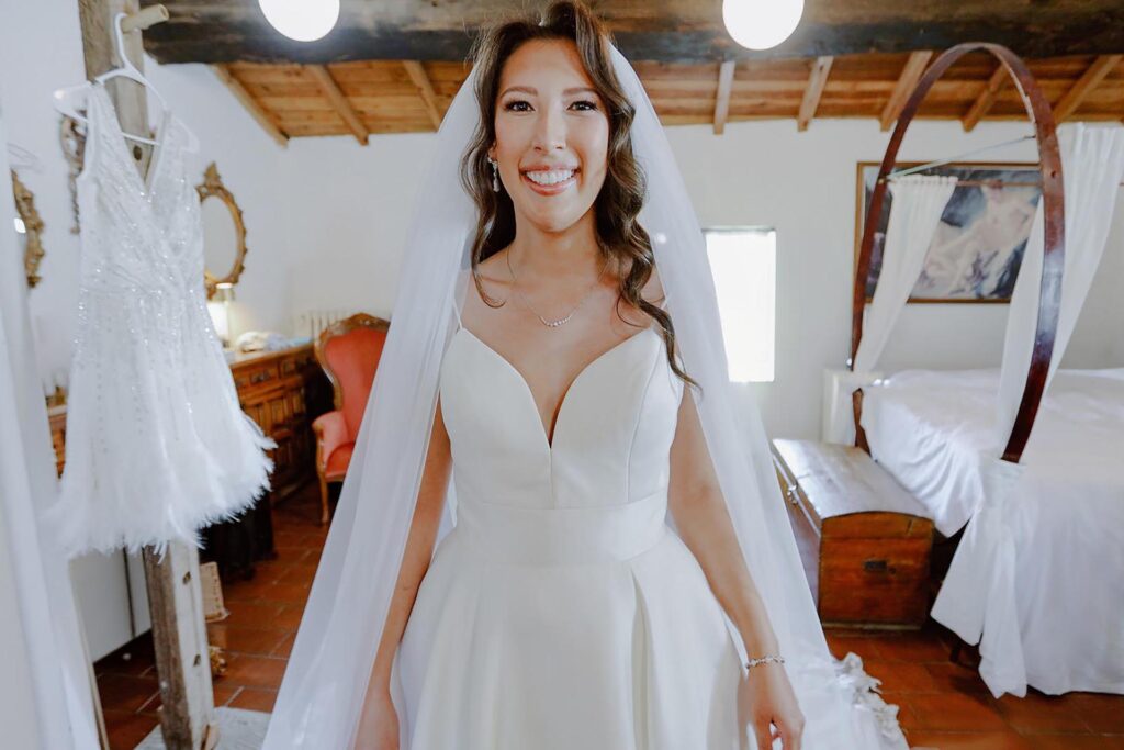
Natural colour editing is all about keeping your wedding photos close to what your eye actually saw on the day. In this style, the goal is to preserve the real atmosphere of your wedding, with accurate skin tones, realistic colours and a timeless look that will still feel fresh years from now. This approach is especially popular with couples who want to remember their day as it truly was, not through a heavy filter or dramatic colour shift.
Technically, natural editing relies on a balanced white balance. This means that whites look clean, not too warm or too cool, and that the subtle differences between shades are visible. Contrast is gently adjusted to give depth without losing detail in shadows or highlights. Retouching is minimal and careful: blemishes or distracting elements might be softened, but freckles and natural skin texture remain. The most important thing is that people still look like themselves, and the setting, whether it’s the stone of a villa in Tuscany or the greens and golds of a Lake Como garden, retains its true character.
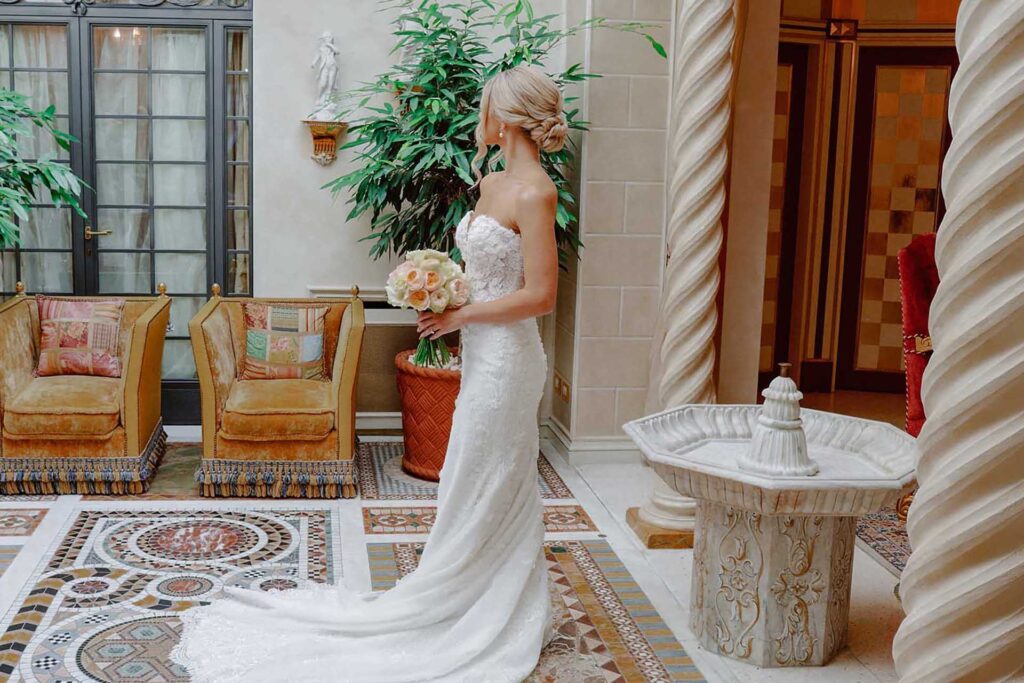
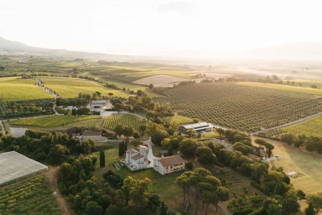
Natural colour editing works particularly well with Italian venues, which often have rich architectural details and distinctive landscapes. With this style, the creamy stone of a Roman church, the terracotta of a Florence rooftop, or the blue of the Amalfi sea all stay true to life. This helps your gallery feel anchored in a real place and time, making your wedding memories vivid and honest.
Consistency is key in natural editing. Your skin tone should look the same in the bright light of the ceremony, the olive-grove shade of the portrait session, and the golden candlelight of the reception. This uniformity ties your gallery together and avoids the jarring effect of photos that shift from pale to orange to grey from one moment to the next.
How to Spot Natural Colour Editing in a Gallery
Look for galleries where people’s skin looks healthy and natural, not overly tanned, pale or pink. Colours should be believable: white dresses shouldn’t look blue, and greenery should feel soft rather than neon or dull. If you want to see how natural editing works in portraits, the article How to Look Natural in Wedding Photos gives some helpful examples. Review several full galleries, not just highlights, to make sure the consistency holds from start to finish. If you find yourself recognising the true colours of an Italian sunset or the details of a historic venue, you’re likely looking at natural colour editing.
Film-Inspired Editing: Vintage Tones and Cinematic Feel
Film-inspired editing is about more than simply applying a filter. At its heart, it is a careful emulation of the look created by classic film stocks like Kodak Portra or Fuji Pro 400H. This involves soft contrast, pastel colours, gentle grain, and a certain richness in highlights and shadows. The result: images that feel both nostalgic and cinematic, as if pulled from a memory or an old movie.
To achieve this, photographers use colour grading. This process shapes the overall mood of your gallery by adjusting colour tones, saturation, and contrast. Warm highlights, cool shadows, and subtle shifts in greens or reds can evoke the feeling of vintage summer afternoons or the soft glow of candlelight at a villa in Tuscany. Grain is sometimes added for depth, but should never overpower faces or details.
Film-inspired editing shines in the Italian light. Sunlit ceremonies on Lake Como, golden-hour portraits by the sea in Amalfi, or celebrations in the ancient halls of Villa Balbianello all suit this style. The gentle colours enhance the softness of lace, the patina of old stone, and the romance of a sunset over Rome’s rooftops. These edits work best where mood and place are as important as the people.
However, film-inspired does not mean washed-out or inconsistent. Well-executed film looks keep skin tones healthy and flattering. Whites should stay creamy, not muddy. Greens should be gentle, not sickly. Consistency across the gallery is vital: a good edit will not make your bouquet look blue in one photo and grey in the next.
Checklist: Is This Film-Inspired Editing Done Well?
Intentional Colour Grading: Do the images have a gentle, cohesive palette (not random filters or clashing tones)?
Flattering Skin Tones: Are faces luminous and natural, not sallow, gray, or blotchy?
Soft Contrast: Do highlights and shadows feel smooth, with details still visible in white dresses and black tuxedos?
Subtle Grain: If there is grain, does it add atmosphere without distracting from expressions or details?
Consistent Mood: Does the whole gallery feel like it belongs together, matching the emotion and setting of your day?
True-to-Place: Can you recognise the warmth of Italian sunlight, the colour of historic walls, or the blue of Lake Garda?
No Washed-Out Moments: Are the blacks rich, not faded to grey, and are whites creamy rather than dull?
When you review a photographer’s gallery, use this checklist to spot thoughtful film-inspired editing. At Image Studio, we take care to ensure each wedding’s mood and setting are honoured through the editing style, especially when couples choose the timeless look of film-inspired colour grading.
Editorial Retouching: Polish, Mood, and Where to Draw the Line
Editorial retouching is about giving wedding photos a polished, magazine-like look. Think of skin that appears smooth but still real, details that pop, and sometimes bold lighting or creative colour grading. This style borrows from fashion and advertising, but it is tailored to honour the uniqueness of your day, not to erase it.
To achieve this, photographers use advanced techniques. Frequency separation lets us smooth skin texture and tone without blurring details. Dodge and burn means lightening or darkening small areas, sculpting faces or adding depth to a dress’s folds. Selective sharpening brings out eyes, jewellery, or lace while keeping backgrounds soft. These methods are time-consuming but allow for a refined finish that stands out.
The key with editorial retouching is knowing when to stop. The goal is not to change who you are or create unrealistic perfection. Most professional editors, including us at Image Studio, will remove distractions like temporary blemishes, stray hairs, or lint on a suit, but we will leave permanent features untouched. Your freckles, birthmarks, scars, body shape, and natural smiles are part of your story. Overediting risks making people look like someone else, or giving skin an artificial look. We aim for polish, not plastic.
If you are drawn to editorial retouching, ask to see a full gallery, not just a few hero images. Look for consistency: does everyone look healthy, natural, and recognisable across different light and settings? Are emotional moments preserved, or do heavily edited photos feel stiff or stylised? Professional editorial retouching should balance mood and realism, letting you see yourself at your best, not someone unrecognisable.
Table: Comparing Editing Styles at a Glance
Feature
Natural Editing
Film-Inspired Editing
Editorial Retouching
Colour Grading
True-to-life, subtle
Vintage tones, soft contrasts
Can be dramatic or stylised
Skin Tones
Natural, minor corrections
Warm, creamy or muted
Smooth, refined, but not altered
Retouching Tools
Basic spot removal
Light grain, film texture
Frequency separation, dodge/burn, selective sharpening
What Is Removed
Red eyes, temporary marks
Minor distractions
Temporary blemishes, stray hairs, lint
What Stays
All features
All features, film look
Permanent features, body shape, natural expressions
Overall Mood
Authentic, timeless
Romantic, nostalgic
Refined, polished, sometimes dramatic
How to Evaluate a Photographer’s Editing Style Before Booking
Steps to Reviewing a Photographer’s Editing Style
Request Full Wedding GalleriesInstagram and website highlights are just the surface. Ask to see two or three complete wedding galleries, ideally from venues or seasons similar to yours. This lets you judge consistency. Look at how the editing holds up from midday sun in the gardens of Villa Cimbrone to candlelit scenes inside a palazzo. Are the skin tones pleasing and natural in every setting? Does the style feel cohesive, or does it shift from photo to photo?
Ask for Before-and-After SamplesBefore-and-after comparisons reveal how much a photographer changes an image. This helps you spot their approach to colour grading, skin retouching, and overall polish. For example, in a natural style, you might see only minor exposure fixes and gentle skin correction. In an editorial style, there may be more pronounced contrast and cleaning up of distractions, but features and expressions remain real.
Check Consistency Across Lighting ConditionsReview images shot in harsh daylight, shade, and artificial light. Does the photographer keep skin tones flattering even at golden hour on Lake Como or under chandeliers in Rome? Consistent editing across varied conditions is a mark of technical skill and careful workflow.
Discuss Retouching BoundariesAsk how the photographer treats skin, blemishes, and body shape. A good rule: permanent features and natural expressions stay untouched. Most remove temporary marks, lint, or stray hairs. If you want more (or less) retouching, say so upfront. For a deeper dive into editorial approaches, see Editorial Wedding Photography Italy: Your 2026 Guide.
Clarify Turnaround TimesFor a full Italian wedding gallery, expect delivery in 4 to 10 weeks. A sneak-peek may arrive within days, but the full set takes time: editing 700 photos can mean six hours just for retouching, on top of culling and exports. Check How Long Does It Take to Receive Wedding Photos? Delivery Time Explained for practical details.
Share Your Preferences ClearlyShow your photographer examples of editing you love. Be specific about skin tone, colour, and how much retouching you expect. This conversation sets the tone for your collaboration.
Choosing a photographer’s editing style is personal and practical. By reviewing full galleries, asking direct questions, and sharing your vision, you ensure your wedding gallery will truly feel like you. If you want to discuss editing approaches for your Italian wedding, you are welcome to contact Image Studio for a portfolio review and a full gallery walkthrough.
Can I request changes to the editing style after seeing my gallery?
Most photographers have a set editing style that is part of their creative process, so major changes after delivery are not always possible. However, if you notice something specific, like a colour shift or an area that feels over-retouched, it is reasonable to ask for small adjustments. It’s best to discuss editing preferences before the wedding and review full galleries in advance so you know what to expect.
Will my photos look dated if I choose a film-inspired or editorial style?
A well-done film-inspired or editorial style is designed to feel classic and timeless, not trendy. Good photographers keep skin tones natural and avoid extreme filters, so your images should age gracefully. Reviewing full galleries from past years can help you see if a style still feels fresh.
How much retouching is too much in wedding photography?
Retouching should enhance your natural appearance, not change who you are. Removing temporary blemishes, stray hairs, or lint is standard, but permanent features like freckles or scars are usually left untouched. If skin starts to look plastic or people become unrecognisable, it is a sign that retouching has gone too far.
What happens if the weather or lighting changes during the day, will editing keep my gallery consistent?
Yes, a careful editing process ensures your gallery looks cohesive even if lighting shifts from bright sun to candlelit evening. Consistency in skin tones and colours is a hallmark of professional editing. This is why reviewing full galleries, not just highlights, is important when choosing a photographer.
Does a more complex editing style mean my photos will take longer to receive?
Yes, more advanced editing styles like editorial retouching or detailed film-inspired grading require extra time. For a full wedding gallery, editing can take from 15 to 25 hours for 400 to 600 photos, and up to 30 to 50 hours for larger or premium weddings. Most couples receive their full edited gallery within 4 to 10 weeks, with a sneak-peek often ready in a few days to two weeks.